Client
Digital Inc agency
Brief
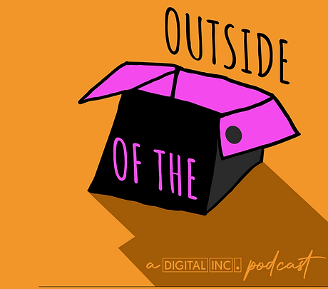
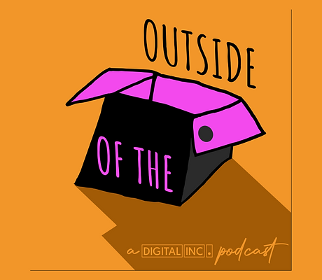
I was tasked to make the digital art for the digital inc podcast out side of the box. I design how the logo looked and once i got the look i imported it on to the computer to edit it and all the colour and text so it was ready to present to everyone watching the podcast. previously i have also done all the artwork for digital inc's social medias such as instagram and twitter including the digital inc logo.
Concept Design
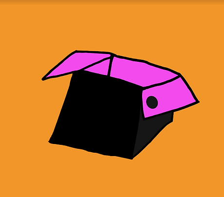
1) When we came up with the name outside of the box i made some destines on paper coming up with lots of different design to the final work.
(use page of different design on book )

Refine Concept
2) Once i decided on the right one to use i redrew it multiple times to refine the design to make it look perfect. This highly improved my drawing skills.

Digitize
3) I took the picture from my drawing pad of the box i drew, then imported the image into illustrator to make it a vector image so i could edit it and add everything i needed to. I used image trace to convert it from a picture to graphics ones it was converted i used tools like polygonal lasso tool to creact the mistakes and errors made by the converson prosessonce.
Colour Palette
4)
Talk more about them and why i used them
Talk about all the options
Talk about how mine works
Also added some suttle hints to digital inc with the color of the inside box and dark hole on the lid.
Digitize
3) this is a video of how i turn my picture on my box into digital art.
Font
4) Talk about
why i used the font
and the different options i had
home made ascetic
all look hadmade
I had multipul different fonts i could of choesen out of but out of them all i chose.

Profile Image
As soon as i did all the work on the box i added the text, i used that font as it looks handmade and that's the ascetics i was going for on this logo, also added a shadow to add depth to the image we could also add digital inc to the shadow to give it more of a better look and as a promotion.

Effects
As soon as i did all the work on the box i added the text, i used that font as it looks handmade and that's the ascetics i was going for on this logo, also added a shadow to add depth to the image we could also add digital inc to the shadow to give it more of a better look and as a promotion.
Complete
once I have done everything I have talked about I am finished exporting it and post
Podcast Audiogram
Cutting-Edge Professional Design
First design
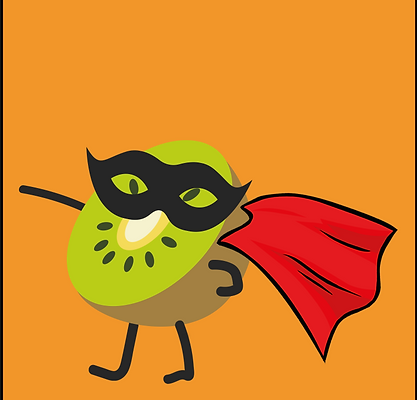
As you can see the first desine of the podcast episode audiogram looks very diffrent, having the orange background just like the out side of the box logo and using the seeds as eyes

Final design
i decided that blue works alot better for a background on this image and the seed eyes didnt look the best so i have it better eyes and added the logo at the top
Audiogram
here is the preview for the podcast. i used ($$$$) to make it. i made the audio sound bar look like a ray of sunshine coming off the hero kiwi. i also added and checked the audio.
Where to find the podcasts
Cutting-Edge Professional Design

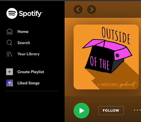
Spotify
I understand the importance of creating a lasting visual impact. My Typography Design services are fully customizable to suit my clients’ needs, allowing me to create the perfect message, from the smallest details on up.
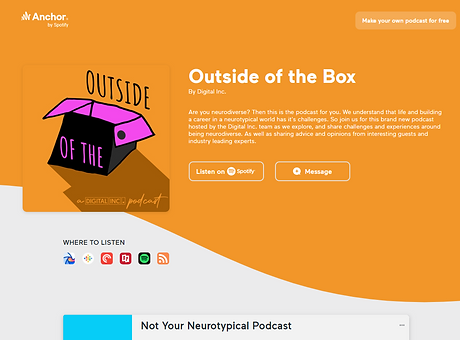
Anchor
When it comes to leaving a lasting impression, it’s vital to use the right combination to create a stylish and visually appealing design. I work hard to ensure my clients get the attention they deserve.

Breaker
Creating strong visual appeal is essential, and my Image Design services can play an integral role in successfully promoting every business. From the initial concept to the final product, I work hard to bring my clients’ visions to life.

Google podcast
I understand the importance of creating a lasting visual impact. My Typography Design services are fully customizable to suit my clients’ needs, allowing me to create the perfect message, from the smallest details on up.