Client
Digital advantage
Brief
Tasked to create profile avatars for digital advantage team members.
Illustrator
I chose to create the avatars in illustrator as it seemed like the best program to use and most of the tutorials I wanted also chose to do it in illustrator, lucky I already knew a lot about illustrator so it was mostly easy.

Research
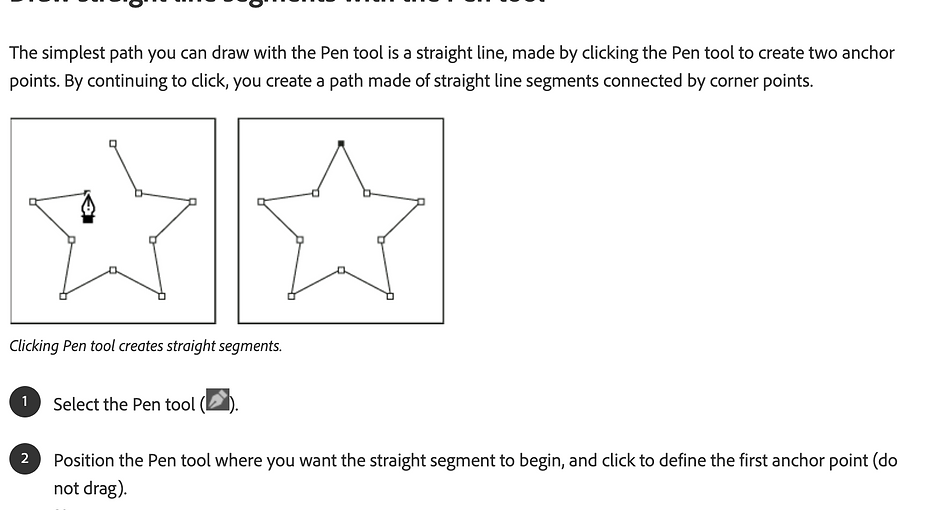
I had a lot of different ways I could have made the avatars and a lot of different art styles I liked that I could try, but before all that, I had to do some research on how to properly make them. I watched some youtube tutorials on different ways to create an avatar. I also had to do a lot of research on the pen tool as I haven’t properly used it before it was tricky to get the hang of it but after a while, I learned how it works, by the time I finished all 4 I knew exactly how to use it.
How I did it
I decided to go with the outline approach instead of creating an avatar with shape tools as they looked more basic and less professional, once I got my image into illustrator I used the pen tool to draw around the face once I was finished with that I outlined facial that was key for the person such as glasses, dimples, and facial hair. Once I had finished doing all the outlines I changed the thickness of the lines so the avatars stand out more. I then needed to add the colours. I also decided to add the Digital Advantage brand green as a background which also made the avatars pop off the screen.

Tools
I used the pen tool to do the outlines, and I also used the select tool to adjust the outlines I drew and I also used the direct select tool to tweak the pen tool if I didn’t exactly draw it to the correct place.

pen tool outline
This is a video of how I used the pen tool to outline the face
Skills
I have learned a lot of skills from this such as
I now know how to use the pen tool really well
I have learned a few more tricks with layers

Colors
I had 3 diffrent options for colors. First i went with plane red then I had the idea to add some outlines to make it stand out more i deceased to go with black for the outlines as i thought that wiuld look the bwst and be the best color combo to go together. I liked the look of the first too deines but i also made a third option just to see how it looked using real colors and it tuernd out alot better then i thought it would, in the end i decided to go with the final version i made as it gave them more of a character it felt more real like it was them. I also tried a lot of different colors to test out how they would look

My experience
I really enjoyed creating all of the avatars seeing how it turned out was amazing and being able to show my work off was a great experience.

Final product
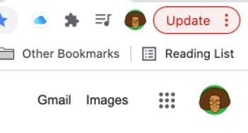
Once I completed the avatars I sent them to everyone at a digital advantage and they changed their google icons to their avatar. I'm really proud of how good they look as are google icons.