Client
Claritas Wealth Management
Brief
Tasked to create a banner design for claritas
Resources
I did some research on how to best design banners I used envato elements to look at some desisnes and also used youtube to find out ways to make it look clean and professional.

Illustrator
I used illistaro to creat the banner as I found it to be alot better for this kind of job instead of photoshop. I have had a lot of illustrator in the past and i knew that all the tools i needed to creat the banners where easly accessible on illustrator.

Tools
The tools i did use where
Opacity- the test was hard to read at times soi put a background behind it and changed the opacity so it wasnt in the way of the image but also visible enough to make the text more readable.
scaling - I changed the original size of the text to make it more readable
Colour- I changed the color of the text to make it stand out more it was also originally hard to read as it was black on dark blue so I needed to be changed to be more visabul.

assets
I had some info such as the phone number and email given to me on an illustrator file, I also got the background images from the google drive of images Claritas uses for their newsletter.
pen tool outline
This is a video of how I used the pen tool to outline the face
Concept art
Once I knew what assets I had I started to come up with lots of different ways I could position all the text getting really creative after I did it all I had to decided on tghr best onese that I thought looked or worked the best, I narrowed it down to 5 different designs they worked out really well and once I went to start making it I made some of my other designs that I liked and they eded up looking alot better on illustrator.

skills learnt
-
How useful opacity tool can be when making text more visible
-
Not mixing simulator colors as it make it hard to see
-
Better eye for detail on the positioning of text

My experience
It was a great experience it was fun and interesting seeing how much the disiens evolved the more i worked on them as my first design is very different but also a bit similor to my final design. I really enjoyed creating theres banners and would love to do more work like this.

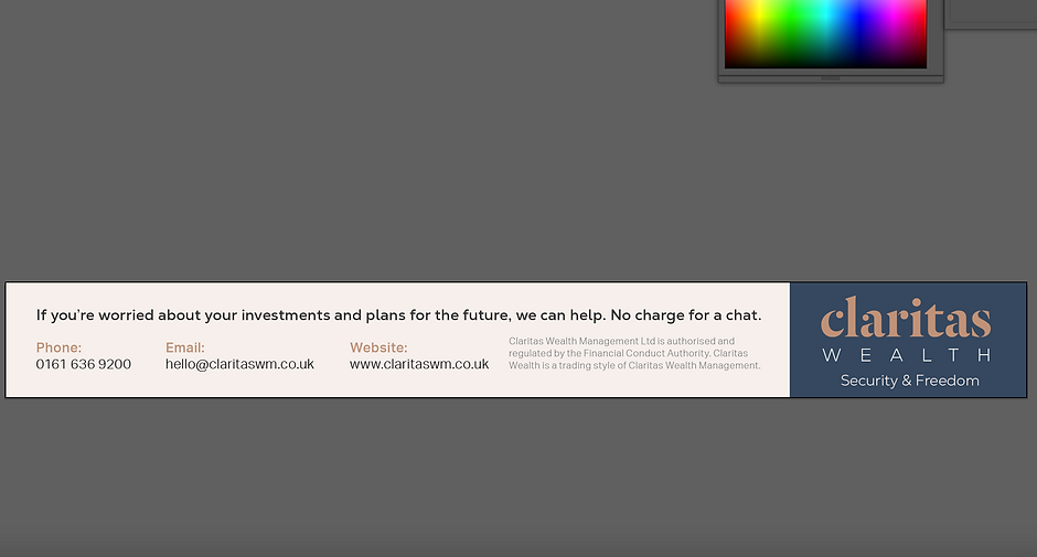
Final product
Here are the final 2 disiens waiting for them to chose what one they want to use.
